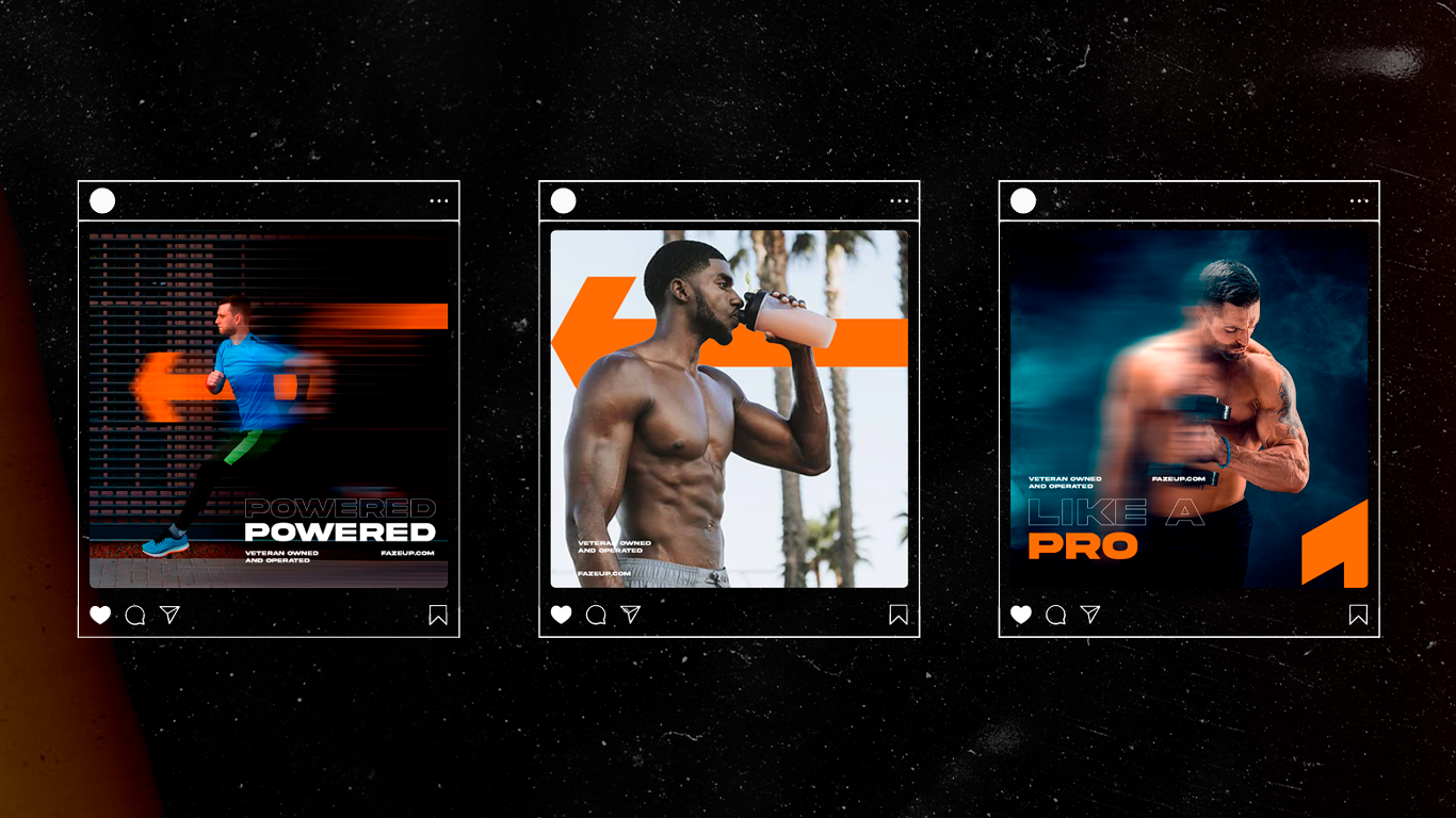
Faze Up is a veteran owned American company focused on the retail sale of products related to health and nutrition, they needed a new logo and complete rebranding of their social media to appeal to new costumers and to expand their brand.
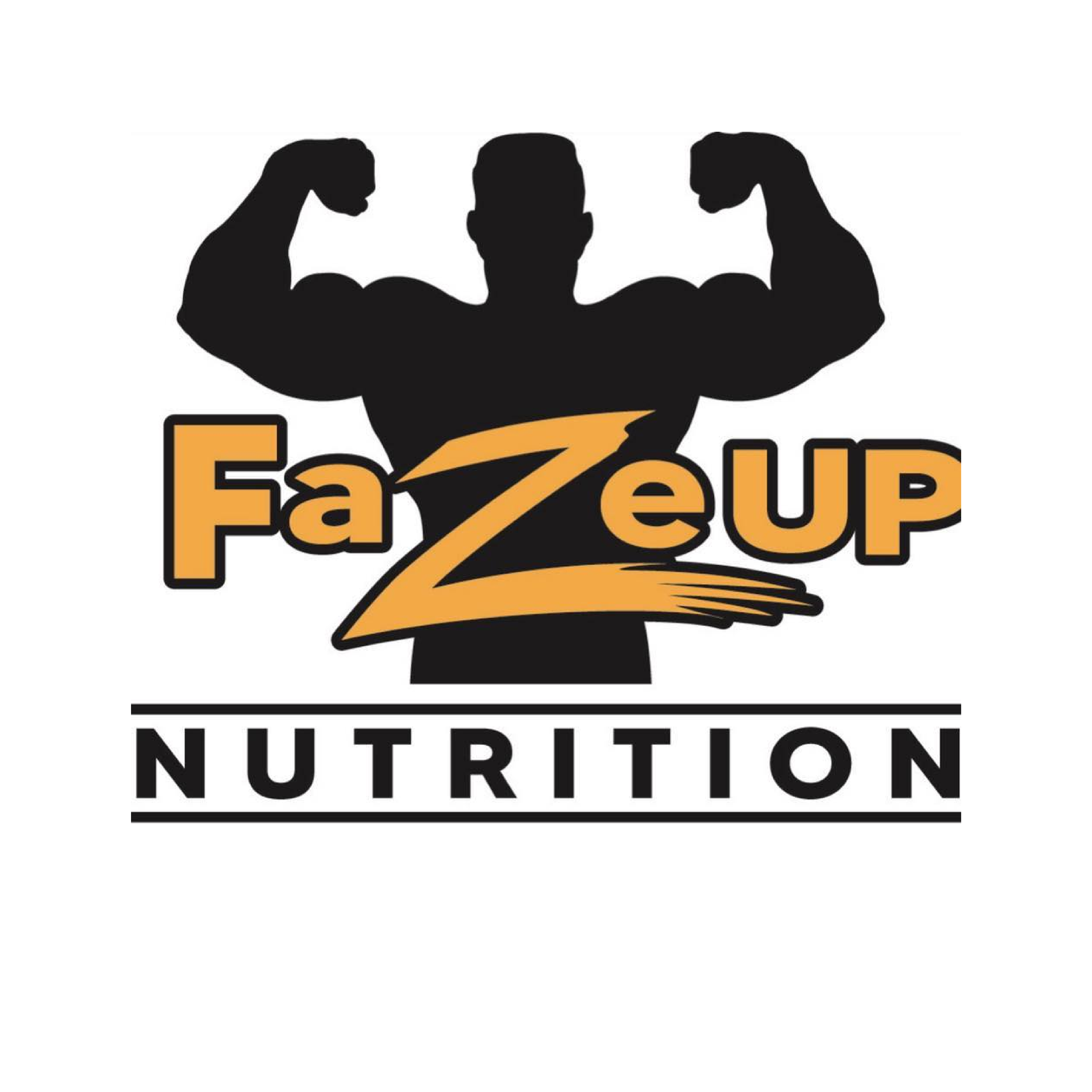
Before
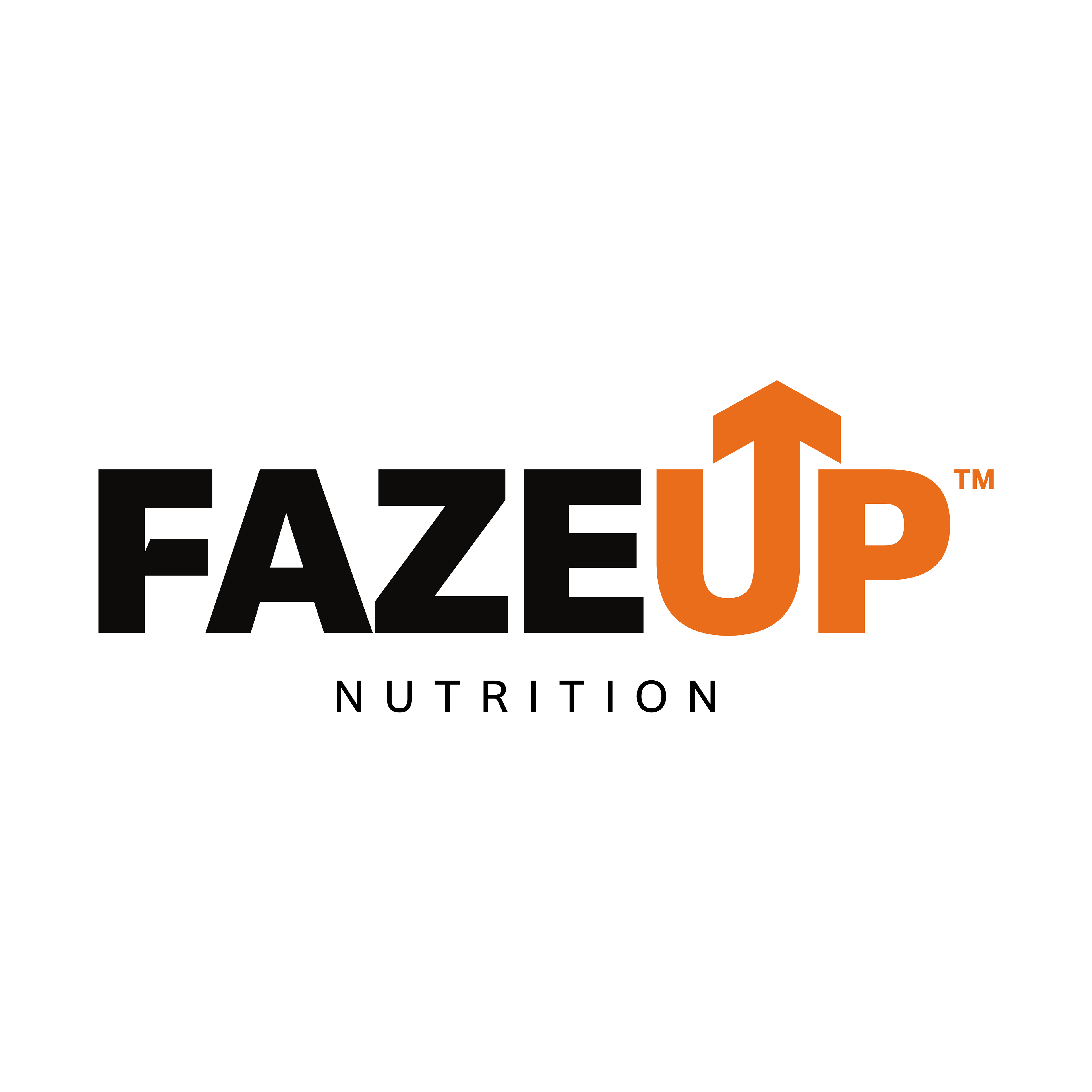
After
To achieve this a new color scheme was utilized, along with a new font to give a more impactful and serious look to the brand. The arrow became FaceUp's new emblem and is ought to be used in most of its branding and merchandising.